Gdoc/Admin

Popular pages

Research and data to make progress against the world’s largest problems.

13,985 charts across 123 topicsAll free: open access and open source

Our Mission

What do we need to know to make the world a better place?

To make progress against the pressing problems the world faces, we need to be informed by the best research and data.

Our World in Data makes this knowledge accessible and understandable, to empower those working to build a better world.

Read about our mission

We are a non-profit — all our work is free to use and open source. Consider supporting us if you find our work valuable.

Donate to support us
As seen on
Logos of the publications that have used our content. From left to right: Science, Nature, PNAS, BBC, Financial Times, The New York Times, The Guardian, The Atlantic, and The Washington Post

Data Insights

Bite-sized insights on how the world is changing, published every few days.

See all Data Insights
The image displays a line graph titled "Population projections until the end of the century." The graph plots population projections from 1950 to 2100, with population values ranging from 0 to 1.8 billion. Four colored lines represent different regions: 

- A brown line indicates population projections for India, showing a steady increase peaking around 2060.
- A blue line represents China, which displays a peak around 2020 before declining.
- A red line shows Europe's population, which rises slightly before declining.
- A green line indicates the United States, which experiences moderate growth before leveling off.

Dotted lines illustrate the projections based on the United Nations' medium scenario assumptions. The data source is listed as "UN, World Population Prospects (2024)." The chart includes horizontal grid lines for better readability of the population figures and timelines. The overall design aims to convey trends in population growth and decline among these regions over time.

India, China, Europe, and the United States are on very different population paths

This chart tracks the UN’s latest demographic projections for four large populations: India, China, Europe, and the United States. Together, they account for about half of today’s world population.

The curves are shaped by what the UN expects to happen to future fertility, life expectancy, and migration worldwide.

India and China are the world’s most populous countries today, and the UN projects that both will remain at the top through the end of the century. Yet their trajectories diverge sharply in these projections.

China’s population has already begun to fall and is projected to more than halve to around 630 million by 2100. India, by contrast, is expected to keep growing for nearly four more decades, reaching about 1.7 billion people in 2060 and gradually declining to around 1.5 billion.

In contrast, the United States and Europe are projected to change more gradually. The US is expected to grow slowly and steadily, reaching about 420 million people by the end of the century. Europe’s population, meanwhile, is projected to decline. Based on these figures, its population peaked around 750 million in 2020, and is expected to fall to about 590 million by 2100, not far from China’s projected level.

The UN’s model is the most widely used baseline for international population comparisons, but all population projections are sensitive to the underlying assumptions. Other research groups use different demographic assumptions about fertility, life expectancy, and migration to reach different long-term population figures.

Explore the UN projections in our Population & Demography Explorer, or compare them with alternative scenarios in the Wittgenstein Centre Human Capital Data Explorer

Continue reading
A line chart showing that large fires in August mean 2025 has been a record year for wildfires in Spain. The data is measured as cumulative area burnt by wildfires in hectares, and the chart has a line for each year from 2012 to 2025. Annotations explain that by August 5th, Spain's wildfires this year were below average. Just two weeks later, 2025 had overtaken all previous years with consistent records. The data source is the Global Wildfire Information System (2025). The chart is licensed CC BY to Our World in Data.

Spain is having its largest wildfire year in well over a decade

The Global Wildfire Information System (GWIS) has published weekly data on the area burned by wildfires since 2012. At the beginning of August, Spain was on track for a relatively low year. Its running total for 2025 was below the average and far below former records.

But just two weeks later, it had overtaken all of these previous years. You can see this in the chart, which shows the cumulative wildfire burn across each year. Large outbreaks in mid-August meant the last record, set in 2022, was rapidly surpassed.

This global dataset from GWIS only dates back to 2012, so it is a relatively short record. However, the European Forest Fire Information System, based on data starting in 2006, also found that this year’s fires were the highest in two decades in Spain.

Portugal has also seen extremely large fires this year.

Note that consistent data is unavailable over longer periods, so it’s hard to give context to the scale of these fires compared to the more distant past.

See how large wildfires in your country have been compared to previous years

Continue reading
A line graph illustrating the share of Hungary's electricity generation by source from 1990 to 2024. The graph highlights four main sources of electricity: nuclear, solar, gas, and coal. 

Nuclear energy is Hungary's largest source with more than 40%; it has been during most of the period shown. Solar overtook gas in 2024 to become the second largest source, at about 25%. Coal's share has fallen from about 30% in 1990 to 6% in 2024.

The data source is credited to Ember, 2025, and the chart is licensed under CC BY to Our World in Data.
A bar chart titled "From candles to electrons: changing lighting sources in the United Kingdom" illustrates the shifting share of lighting powered by various energy sources from 1700 to 2000. Different colored bars represent energy sources: candles, whale oil, gas, kerosene, and electricity. 

In the early 1700s, 90–95% of lighting was from candles. From 1750–1800, whale oil rose in usage to about 10%. 1850 saw a move to gas, which accounted for 78%. 1900 saw an introduction of kerosene, at 15%, with 82% still coming from gas. By 1950 and continuing to 2000, electricity makes up nearly 100%, indicating a major shift in lighting sources. 

The data source is attributed to Fouquet & Pearson (2006). The chart is licensed CC BY to Our World in Data.

From candles to electrons: changing lighting sources in the United Kingdom

Many of us take artificial light for granted. Most of us use it daily: we can read, cook, and do tasks indoors; students can study at night; and our communities and homes are safer when not cloaked in darkness.

It’s not just light that has been transformative, but cheap light. The price of lighting has fallen by more than 99.9% since the 1700s.

Changes in what we use to power lighting have been crucial to the plummeting costs. This chart, based on data from Fouquet and Pearson, shows these changes from 1700 to 2000.

In 1700, the typical British household lit its evenings with candles. In the 18th century, they started using whale oil, and by the 19th century, they saw the rise of burning gas. Kerosene briefly provided a fifth of light around 1900. With each transition, lighting became more efficient, and the costs dropped. But the defining transition has been to electricity. It now provides almost all of the UK’s artificial light.

For hundreds of millions of the world’s poorest, lighting at night is still a luxury, and will remain so until they get access to electricity.

Explore what the cost and distribution of lighting tell us about human development

Continue reading
This image is a line graph depicting homicide rates in Ecuador from 1990 to 2023, measured as annual deaths from homicide per 100,000 people.

Initially, the graph shows low homicide rates, peaking near 20 per 100,000 around 2010, a time when Ecuador had some of the lowest rates in Latin America. However, there is a noticeable upward trend beginning around 2020, with rates increasing sharply. By 2023, the rate has surged dramatically to 46 per 100,000, indicating a more than fivefold increase from previous levels.

The data source listed at the bottom is the United Nations Office on Drugs and Crime, dated 2025. The chart is licensed under CC BY for Our World in Data.

Homicide rates in Ecuador have increased steeply in the last few years

For most of the 2010s, Ecuador had some of the lowest murder rates in Latin America. According to data from the UN Office on Drugs and Crime, rates were often three or four times lower than the regional average.

But as you can see in the chart, homicide rates have risen steeply in the last few years. From 2020 to 2023, rates increased more than fivefold. To put this in context: the number of people murdered each year increased from roughly 1,400 to 8,200.

Ecuador went from being one of the safest countries in the region to having one of the highest murder rates, not only in Latin America, but in the world as a whole.

This increase in violence has been linked to Ecuador’s growing role in international drug trafficking and competition between criminal groups. Large outbreaks of prison violence, often involving rival gangs, have also contributed.

Estimates of homicide rates can vary between sources; read our explainer on differences between them

Continue reading
The image illustrates the increase and diversification of meat consumption in China over the past 60 years, measured in kilograms per person per year. It features a bar graph with four major years highlighted: 1962, 1982, 2002, and 2022. In 1962, meat consumption was only 4 kilograms per person. By 1982, it rose to 15 kilograms, with pork comprising 84% of the total meat supply. In 2002, it further increased to 45 kilograms. By 2022, the total per capita meat supply reached 70 kilograms, with pork making up 57% of the total. Other categories include beef, poultry, and sheep/goat, which are represented in varying colors. 

The data source for this information is the UN Food and Agriculture Organization, published in 2024, and the content is licensed under CC BY.

Over the last six decades, China has rapidly increased and diversified its meat consumption

Go back to China in the 1960s, and you’ll find that the average person ate very little meat. This isn’t surprising: most of the country lived in extreme poverty and could not afford it. Meat consumption is strongly correlated with income: as countries get richer, they tend to have more diverse, meat-heavy diets.

However, as the chart shows, meat supply per person has increased significantly over the last sixty years. In 1962, annual consumption was just 4 kilograms per person. By 2022, it had increased almost 18-fold to 70 kilograms.

It’s not only the amount of meat consumed that’s changed: people in China also eat a more diverse mix. In the 1960s and 1980s, almost all meat came from pork. Today, pork still dominates, but it is joined by more poultry and beef.

This change in diet matters for various reasons. More diversified diets (which are not only about animal products) tend to be more nutritious than monotonous staple-heavy diets that are common for people living in poverty. But this increase in meat consumption also comes with a large environmental impact and consequences for animal welfare.

Explore how meat consumption has changed in your own country

Continue reading
The image presents a horizontal bar chart that illustrates the contributions of various scientists whose innovations have saved millions of lives. Each bar represents the estimated number of lives saved by a specific medical innovation, with the bars increasing in length from left to right to indicate more lives saved.
Many significant innovations are listed, including the development of different vaccines, medical procedures, and treatments that have saved millions. 
The footer provides sources for the estimates shown, acknowledging that except for information Sarah Gilbert's contributions, all estimates are from Science Heroes.

Counting lives saved is difficult, but it can show us the great difference some people have made

Scientists can make an enormous difference in the world.

Take the researcher Sarah Gilbert, who has dedicated her career to developing vaccines. Over the last two decades, she has contributed to vaccines against the flu, MERS, Nipah virus, and Rift Valley fever. When she heard about the outbreak in China in January 2020, she began working on a vaccine, just in case. By the end of that year, the vaccine against COVID-19 was approved, saving an estimated 6.3 million lives in the following year alone. Without this effort, we would have faced a much darker reality, marked by lockdowns, overwhelmed health systems, and widespread suffering.

This chart lists many such scientists whose work saved many people’s lives. The estimates are taken from the web publication Science Heroes, where you can find profiles of these scientists.

It’s difficult to estimate the exact difference particular innovations have made, and I take all such estimates with a grain of salt. None of these scientists did their work in isolation; their innovations were achieved thanks to collaborative efforts and the earlier work of other researchers.

Our team spends much of its time counting deaths, but it’s equally important to know the number of lives saved — even though it is harder to estimate and involves much larger uncertainty. It’s inspiring to be reminded that creative, enterprising, and tenacious people can enormously contribute to our lives.

Fritz Haber and Carl Bosch, who invented synthetic fertilizers, are at the top of this list. My colleague Hannah Ritchie wrote an article about the difference their work has made: How many people does synthetic fertilizer feed?

Continue reading

Get Data Insights delivered to your inbox

Receive an email from us when we publish a Data Insight (every few days).

By subscribing you are agreeing to the terms of our privacy policy.

Explore our data

Featured data from our collection of 13,985 interactive charts.

See all our data

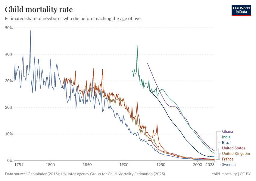
What share of children die before their fifth birthday?

What could be more tragic than the death of a young child? Child mortality, the death of children under the age of five, is still extremely common in our world today.

The historical data makes clear that it doesn’t have to be this way: it is possible for societies to protect their children and reduce child mortality to very low rates. For child mortality to reach low levels, many things have to go right at the same time: good healthcare, good nutrition, clean water and sanitation, maternal health, and high living standards. We can, therefore, think of child mortality as a proxy indicator of a country’s living conditions.

The chart shows our long-run data on child mortality, which allows you to see how child mortality has changed in countries around the world.

Explore and learn more about this data

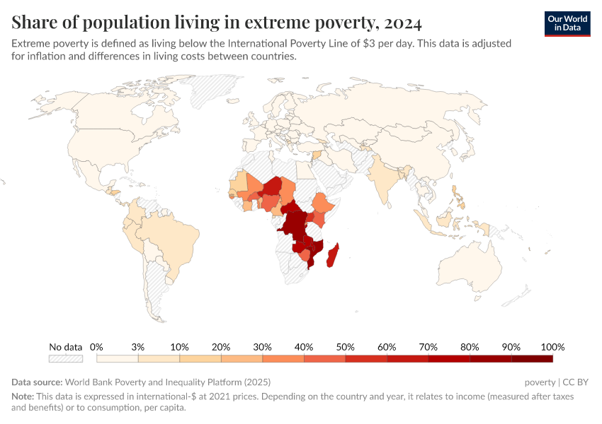
Share of population living in extreme povertyWorld Bank

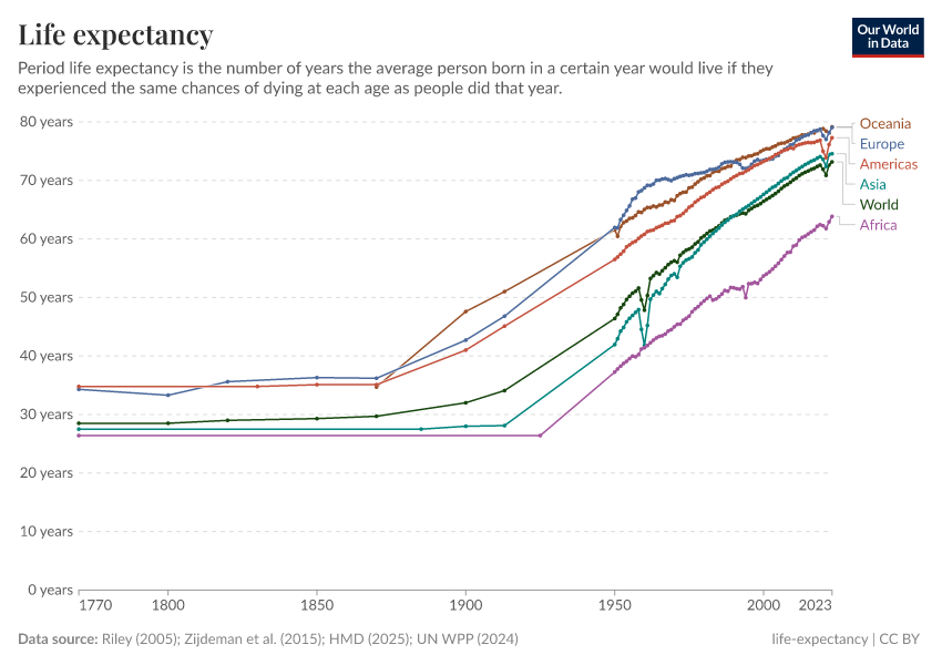
Life expectancyLong-run estimates collated from multiple sources by Our World in Data

CO₂ emissions per capitaLong-run estimates from the Global Carbon Budget

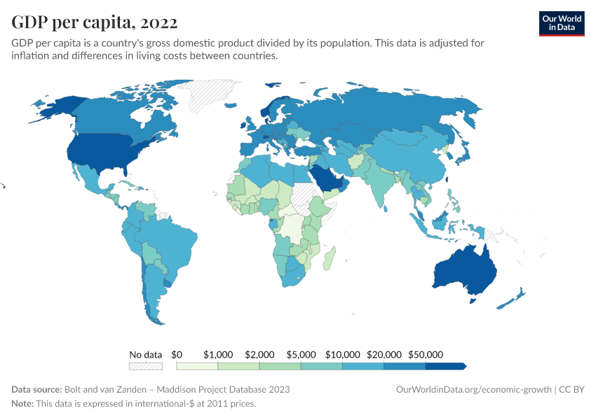
GDP per capitaLong-run estimates from the Maddison Project Database

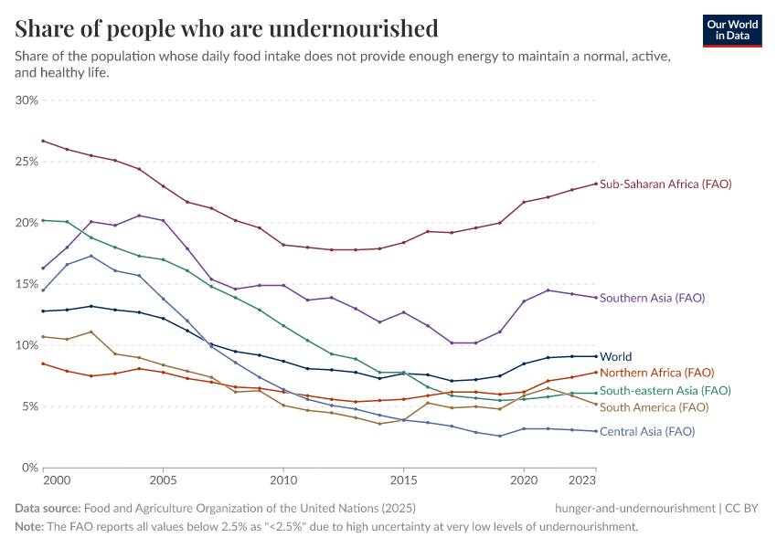
Share of people who are undernourishedUN FAO

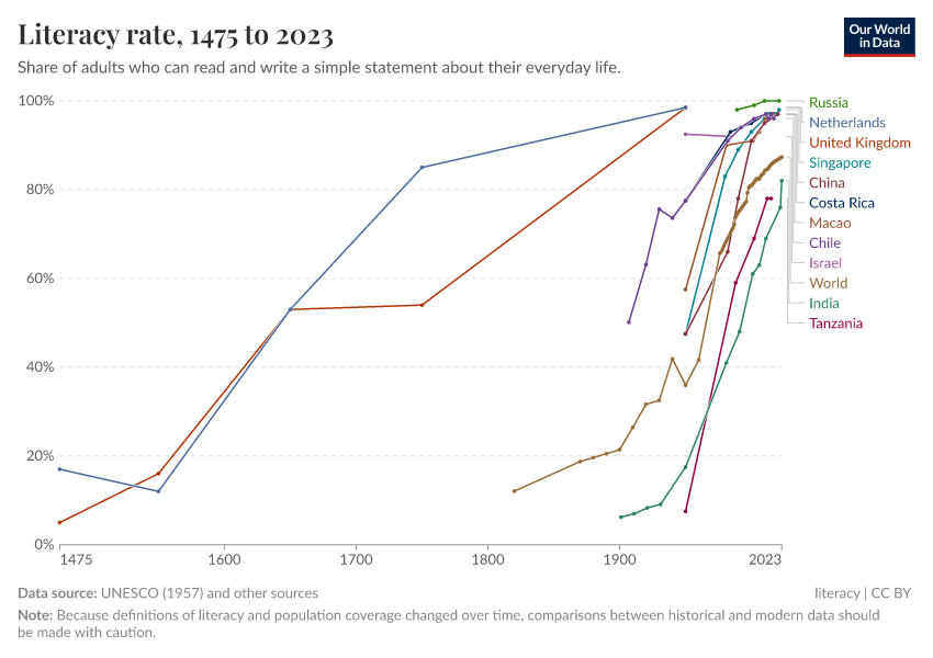
Literacy rateLong-run estimates collated from multiple sources by Our World in Data

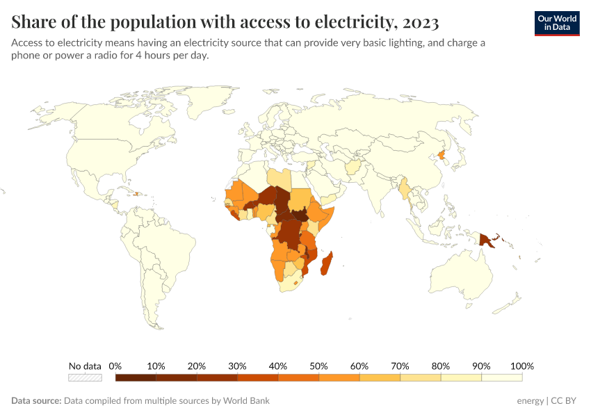
Share of the population with access to electricityWorld Bank

Data explorers

See all our Data Explorers

Interactive visualization tools to explore a wide range of related indicators.

Subscribe to our newsletters

Receive our latest work by email.
By subscribing you are agreeing to the terms of our privacy policy.

All our topics

All our data, research, and writing — topic by topic.

Population and Demographic Change

Health

Energy and Environment

Food and Agriculture

Poverty and Economic Development

Education and Knowledge

Innovation and Technological Change

Living Conditions, Community and Wellbeing

Human Rights and Democracy

Violence and War